


Photo by Firmbee.com on Unsplash
How to make your mobile APEX application look like a native one - Part 2
Build mobile friendly forms


Introduction
This is the second part of a series of blog posts on customizing the look and feel of the Oracle APEX mobile application to mimic a native application. You can read part one on the general look and feel of the application here. This part will focus mainly on creating mobile-friendly forms to make your users happy to use your application. You'll see that by using the right input type or adding a simple attribute, you can completely change your application. Let's see it!
The layout of the form
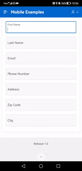
My main advice for the layout of the forms is to rely on the default settings of the Universal Theme. At the time of writing this article, the current version of APEX is 22.1 and it does a very good job of handling the layout of entries for the various screen sizes.
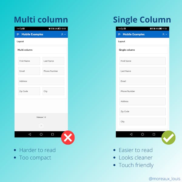
Here is three simple topics that I want to talk about:
- Always use a single column layout, it is easier to read and fill in. In fact, the Universal Theme did a very good job with this and I had to use CSS Responsive Classes to take this screenshot.
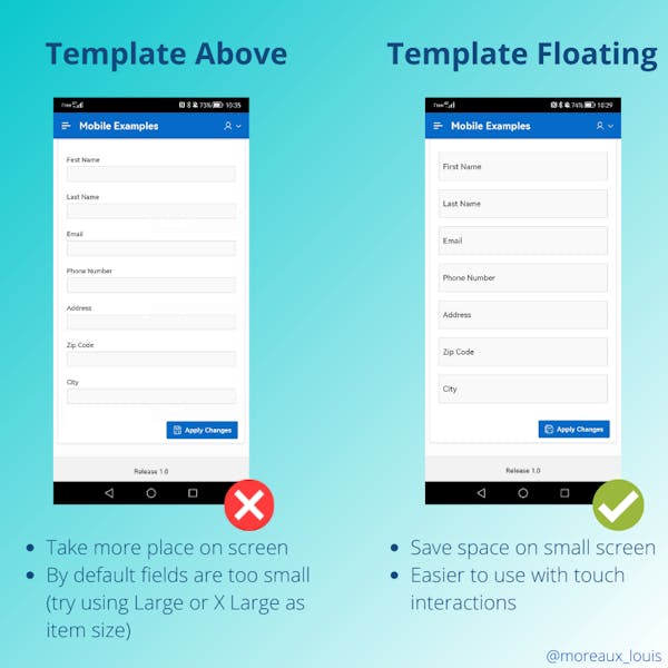
- Use the floating (default) or above page item template option, this will save space and make the forms more readable. My preference is for the floating labels but if you must use the above option, try using the Large or X Large item size to facilitate tactile interactions. Nothing is more annoying than selecting the wrong input on a form.
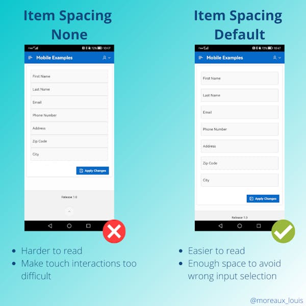
- This brings us to the final tip on form layout: don't change the default spacing of items. You'll save space, but you'll irritate your users by leading them to a wrong input selection. See the screenshot below, do you really think it's possible to use it with your fingers?
Choosing the right input types
HTML has many input types and they are there for a reason, so use them! As we develop applications using APEX, we won't have total control over the markup but we rely on choosing the right page item type with the right option. But, sometimes, you'll see, adding a simple HTML attribute can change everything.
The virtual keyboards are important
When targeting mobile devices, your users will need to use virtual keyboards and not real keyboards like computer users. This is very important because you can help them by choosing the right item type and attribute option. Here is a screenshot of the different keyboards I get on my Android mobile depending on the type I defined:
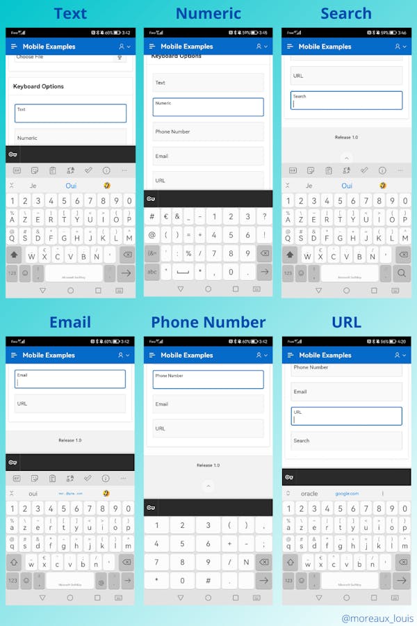
Believe me, having the right keyboard will make your users happy to fill out your forms. For example, the one associated with the email type field got the "@" to the right of the space bar or the one associated with the phone number type, got the keys needed to enter the prefix and numbers. The good thing is that, for the most part, it is completely handled by APEX, by choosing the right attribute on the Text Field item type :
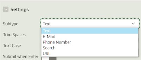
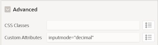
But sometimes you want to change the default behavior and you can use the inputmode attribute to do so. For example, I had to use it for the Number field because, by default, it only displayed a normal keyboard (the same as a Text field). To correct this, I added the attribute inputmode="decimal"
Improving date and time entry
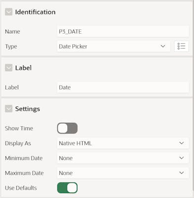
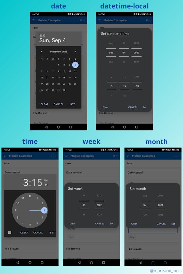
If you are developing with Oracle APEX and need to enter dates and/or times, you will choose the Date Picker item type, which makes sense, but don't forget to change the attribute under Settings\ Display As to "Native HTML".
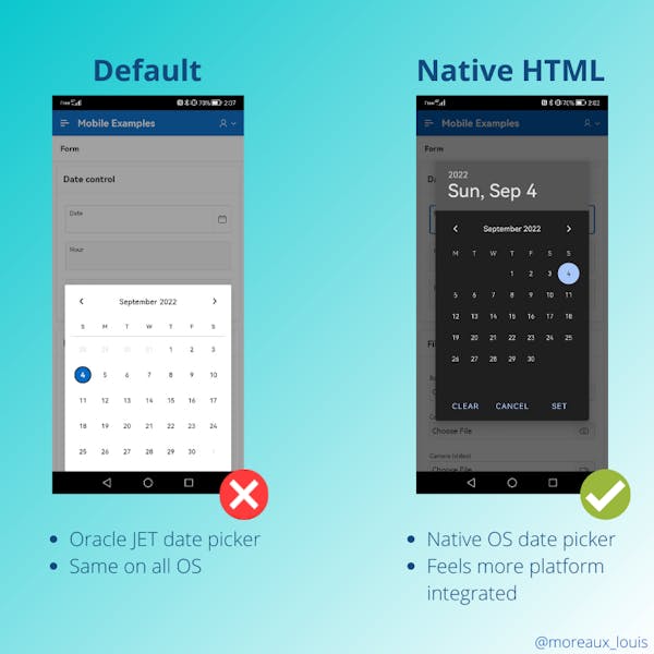
You will ask why I recommend changing the default option. Then I think the best answer is to show you the difference
Oracle APEX implements the input type "date" and "datetime-local" depending on whether the attribute "Show Time" is turned on or off. But there are three other types available which are "time", "week" and "month". It is possible to use it by choosing the item type "Text Field" and modifying the type attribute during the page loading by adding this JavaScript code:
// Change the type of the item P3_HOUR to time
apex.jQuery("#P3_HOUR").attr("type", "time");
// Change the type of the item P3_WEEK to week
apex.jQuery("#P3_WEEK").attr("type", "week");
// Change the type of the item P3_MONTH to month
apex.jQuery("#P3_MONTH").attr("type", "month");
Here are the screenshots of the different types available and how the operating system provides you with a specific user interface to fill in the fields
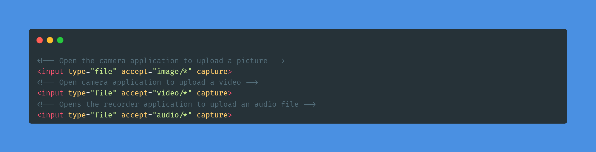
Improving standard file browsing
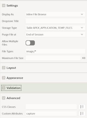
Oracle APEX provides a File Browse item type to allow users to upload files via an application. We can make the experience much better on mobile devices by using the capture attribute
Here is how you can add it to a page item inside the APEX builder
To see it in action, I recorded a little video. Pretty cool, isn't it?
Note: I tested it on an iOS device and it appears that the microphone option was not working on this browser. This is the limit of the web developement, we rely on how each browsers implements the standard specification.
Autocomplete is your friend
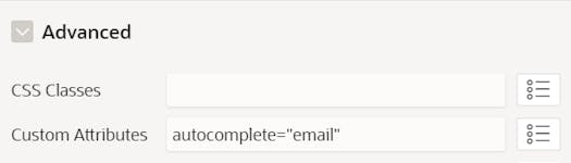
HTML has an attribute (autocomplete) that allows your users to reuse some information already stored in their browser like email, phone number or addresses. It is particularly useful for registration pages to speed up the filling of the form, here is an example:
So how do you apply it? Just add this attribute with the value of your choice under Advanced - Custom Attributes:
I recommend looking at the different values of this attribute to have full control over the autocomplete of your forms (there are many options available). But, more importantly, sometimes you'll want to disable it altogether and you can do that by using autocomplete="off". While writing this post, I found that Chrome was acting a little differently by not implementing the off value correctly. You can fix this behavior by using autocomplete="chrome-off" to target that browser. Here is the JavaScript code I used to handle it:
// Targeting Chrome only
if ( navigator.userAgent.includes("Chrome") ) {
   // Loop through inputs for which we want to disable autocomplete
   apex.jQuery('input[autocomplete="off"]').each(function() {
      // Replace the attribute value by the chrome specific one
      apex.jQuery(this).attr("autocomplete", "chrome-off");
   });
}
Clearly validate the user's input
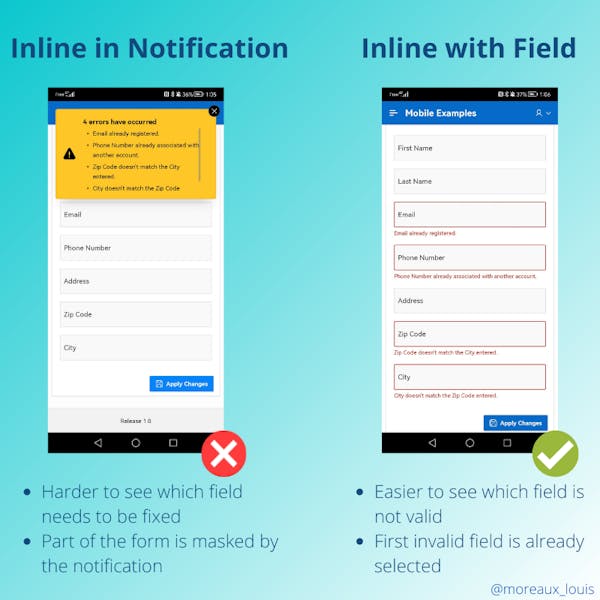
Choosing the right display location
Speaking of validation the first tip is to always set the attribute "Display Location" to "Inline with Field" and select the page item into "Associated Item"
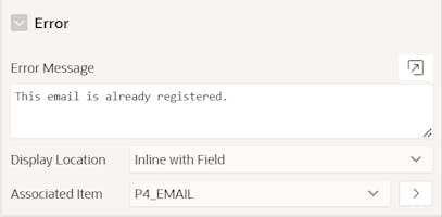
Why should you use this? Because this way your user will clearly see which entries are invalid and why. If you display the validation as a notification or worse on an error page, it will be very difficult to see it on a mobile device.
Validation on the client side
When targeting mobile devices, you need to understand that filling out forms can be time consuming if you have to come back to correct entries. A good solution to avoid this is to perform client-side validation as the user types.
Here is the code used to register this example, first I defined a JavaScript function called validateForm under the Function and Global Variable Declaration attribute of the page
function validateForm() {
    let errors = [];
    apex.message.clearErrors();
    // Validate only if the field is not empty
    if ( apex.items.P5_USERNAME.isEmpty() === false ) {
        // Display an error if you someone try to use my first name
        if ( apex.items.P5_USERNAME.value === "Louis" ) {
            errors.push(
                {
                    type:       "error",
                    location:   "inline",
                    pageItem:   "P5_USERNAME",
                    message:    "Username is not available.",
                    unsafe:     true
                }
            );
        }
    }
    // Raise an error if the field is not empty and not valid
    if (apex.items.P5_EMAIL.isEmpty() === false && apex.items.P5_EMAIL.getValidity().valid === false) {
        errors.push(
            {
                type:       "error",
                location:   "inline",
                pageItem:   "P5_EMAIL",
                message:    apex.items.P5_EMAIL.getValidationMessage(),
                unsafe:     true
            }
        );
    }

    apex.message.showErrors(errors);
}
I then called this function under the Execute when Page Loads attribute. Note that we use apex.util.debounce to add a delay while users enter data to reduce the number of validation executions.
apex.jQuery( "input" ).on( "keyup", apex.util.debounce( validateForm, 200) );
I you want to know more about client-side validation, I recommend you to read a great blog post of my colleague Plamen Mushkov on email address validation here. Another great read is this post by John Snyder.
A final note on this subject, even if you perform client-side validation, I recommend that you always perform server-side validation as well. You can never be too careful!
Format your items or at least give a hint
When requesting formatted information such as credit card number, phone number, or IP address, it's a good idea to always give your user a hint as to what format you expect. Nothing is more annoying than typing an entry and realizing that you forgot to add the separator that is needed to validate the field. You have two main options for this in Oracle APEX, the help text and the placeholder. The main advantage of the first option is that it will be present even if you have started typing the value.
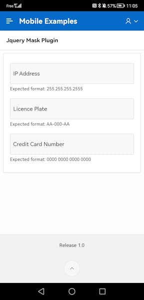
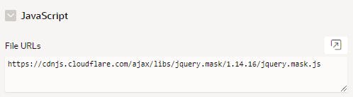
Another option is to use a JavaScript library such as JQuery Mask Plugin o help your user enter the value and ensure that you get the format you expect. Using this library is quite simple in APEX :
- Add the library to the page under JavaScript \ File URLs. I used the CDN here but you can download the file and add it to the static application files.
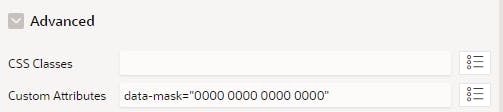
- Add the data-mask attribute to the items under Avanced \ Custom Attributes. Here is the example I used to mask the credit card number
- Run your page!
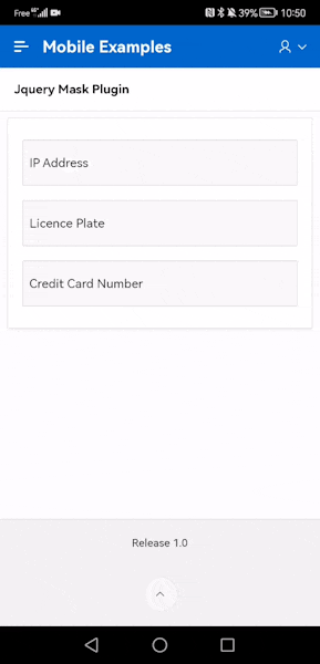
I find that with minimal effort, you can greatly improve the user experience by combining the addition of accurate help text and an automatic mask.
Conclusion
In this article, we have seen that we can greatly improve the user experience by sometimes adding a simple HTML attribute like inputmode to change the default keyboard. Or by using a third party library that will help you validate user input or get the value in the format you expect. I think the main point here is to decide the time you want to spend to customize the look and feel of your application. Fighting against native apps even with PWAs is not easy, but you can surely build something really good.
I really hope you enjoy reading this blog post as much as I enjoyed writing it 😊. I will continue this series but I don't know at this time what the next one will be about. Stay tuned!
References
- inputmode attribute on the MDN website
- autocomplete attribute on the MDN website
- apex.message.showErrors JavaScript function
- apex.util.debounce JavaScript function
- Blog post APEX Client-Side Validation by John Snyder
- Blog post APEX validations: Email address by Plamen Mushkovg
- Jquery Mask Plugin library