CSS Scroll Snap and Oracle APEX card region

Oracle APEX Developer (Insum) from Paris Contributor of Flows for APEX Passionate about APEX and web development.
Introduction
Last week I was looking at the Scroll Snap CSS module and discovered that by combining it with the card region in Oracle APEX, it is possible to create beautiful mobile UX. I tweeted about it and got some great feedback from the APEX community. So I decided to write a quick blog post about it.
CSS Scroll Snap module
The Scroll Snap module let you define how to display the content of the srolled container at the point where the scroll ends. If you want to know more about it, I recommend you to read the related article on the MDN' website.
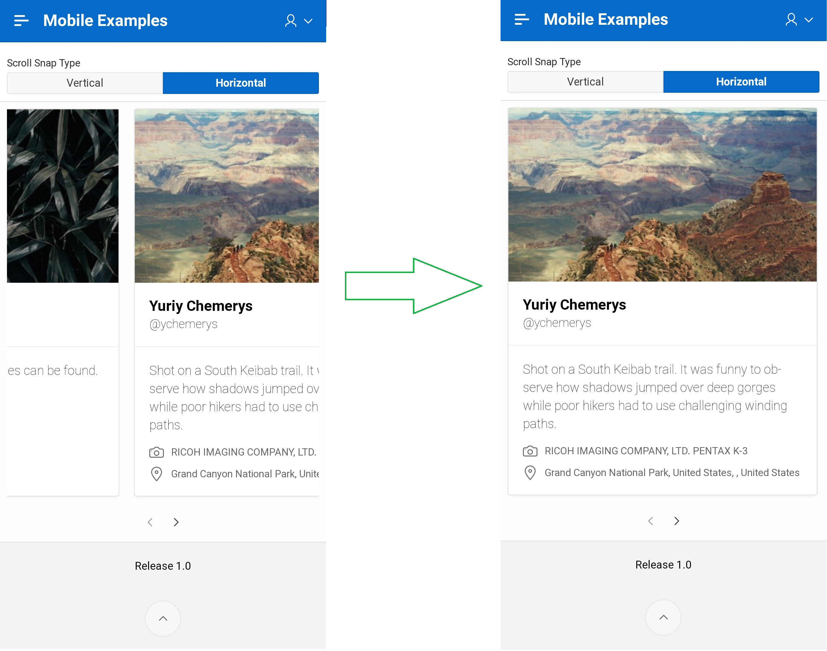
I think you can find many more use case for this CSS magic module but the main that come to my mind was the card region. In a mobile UI, you would like to be able to scroll either vertically or horizontally, and at the end of the scroll, always displays an entire card. See the behaviour, without and with Scroll Snap enable below 👇
Implementation
Scroll switcher
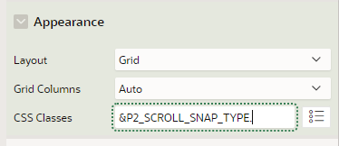
First, I created a page item P2_SCROLL_SNAP_TYPE (radiogroup) to let the user decide if he wants to scroll horizontally or vertically. The return value of each values is a CSS class scroll-snap--vertical or scroll-snap--horizontal. Make sure the "Page Action on Selection" attribute is set to Submit Page.
Card region
Then under Appearance \ CSS Classes of the card region, I applied the scroll specific class by adding the page item substitution syntax.
I then faced an issue because the card region has a scroll container and the class was not added to it but to its child. So I have to add a dynamic action on the card refresh event to dynamically add it:
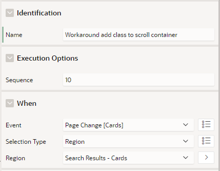
Add a single action of type Execute JavaScript Code (make sure the attribute Fire on Initialization is set to on under Execution Options) with the following code:
// Add the specific class to the parent container
apex.jQuery("div.a-TMV-w-scroll").addClass(apex.items.P2_SCROLL_SNAP_TYPE.getValue());
CSS
Finally add this CSS code to your page:
/*Scroll vertical*/
div.a-TMV-w-scroll.scroll-snap--vertical {
    scroll-snap-type: y mandatory;
    height: 75vh;
}

ul.a-CardView-items.scroll-snap--vertical {
    grid-template-columns: 95vw;
}

ul.a-CardView-items.scroll-snap--vertical li.a-CardView-item {
    scroll-snap-align: start;
}

/*scroll horizontal*/
div.a-TMV-w-scroll.scroll-snap--horizontal {
    scroll-snap-type: x mandatory;
}

ul.a-CardView-items.scroll-snap--horizontal {
    grid-auto-flow: column;
    grid-template-columns: repeat(15, 95vw);
}

ul.a-CardView-items.scroll-snap--horizontal li.a-CardView-item {
    scroll-snap-align: start;
    width: 95w;
}

.no-anim .a-CardView-item > div {
    display: none;
}
Run your page and tada 😍
Note on the last CSS rule (.no-anim class): by default, during page rendering, placeholders are displayed for cards but in this case, we don't want to see them.
Many thanks to Steve Muench who publish the solution in this great blog post.
I hope you enjoy this tip and, as usual, a working example can be found here. Try it with a mobile device, the experience will be much better😉.


