


On a project, I needed to display data with a classic report and a card region. This part was simple but the second requirement was to be able to select items in the classic report and card region. I wasn't sure if this was a standard feature for the card region so I had to dig further. Bad news, it's not a standard feature :-(, but good news, we can add it very easily.
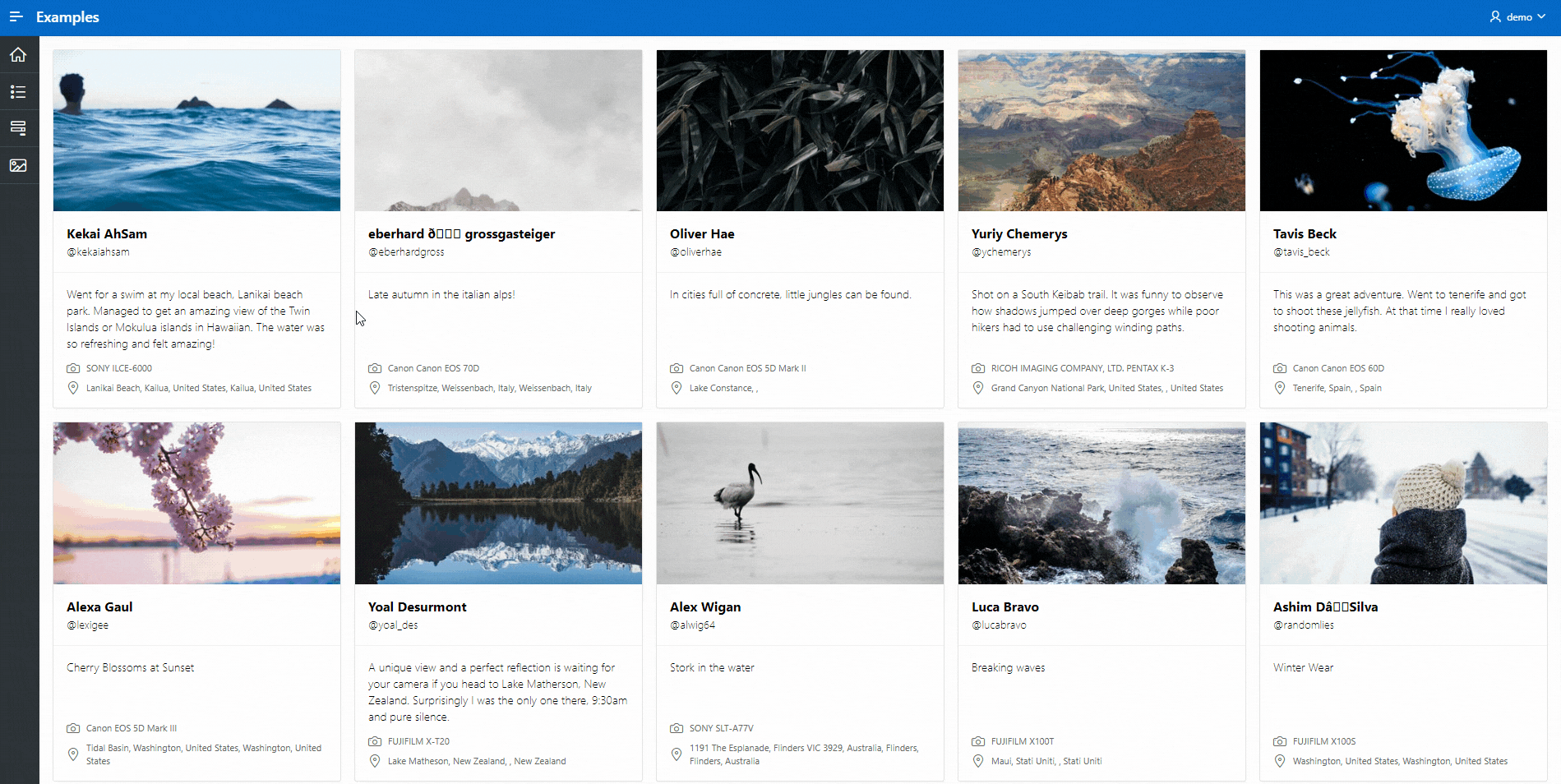
For this example, I used the unsplash dataset which is great for building demo with cards. I simply uploaded the photo.tsv000 file into a new table unsplash_data using Data Workshop.
First, declare a new javascript function under the Function and Global Variable Declaration attribute of your page. This function will look at the state of the item (selected or not) and add or remove a class.
function toogleCard(id) {
   // Get the card-item based on the id
   let card = apex.jQuery(".a-CardView-item[data-id="+ id + "]");

   // Get the cardView that holds the selection class
   let cardView = card.find("div.a-CardView");

   // Look for the selected class
   if (cardView.hasClass("selected")) {
      cardView.removeClass("selected");
   } else {
      cardView.addClass("selected");
   }
}
Then, create a card action of type Media and reference that function by defining the link type to Redirect to URL and the target to javascript:toogleCard(&ID.); (make sure ID is the primary key column of your card region).
Finally add this CSS code to your page:
/* Reduce the opacity of images for selected items */
div.a-CardView.selected img.a-CardView-mediaImg {
  opacity: 0.5 !important;
}

/* Add the check mark */
div.a-CardView.selected > .a-CardView-media:after{
  content: "\f058";
  font-size: 2rem;
  font-family: 'Font APEX Large' !important;
  color: #2e5afd;
  position: absolute;
  z-index: 2;
  top: 0.5rem;
  right: 0.5rem;
}

/* Overwrite the link opacity on focus and the transition */
.a-CardView-media a:focus {
    opacity: 1;
}
.a-CardView-media a {
   transition: none;
}

/* Add box-shadow and border to highlight selected cards */
div.a-CardView.selected {
  box-shadow: 0 0 rgb(0 0 0 / 0.1), 0 0, 0 4px 6px -1px rgb(0 0 0 / 0.1), 0 2px 4px -2px rgb(0 0 0 / 0.1);
  border-color: #2e5afd;
}
If you have follow the three steps, you should get something like this
As usual, a working example can be found here. Starting from that example, you could store the selection in a collection or a page item in the toogleCard function to be able to process them later ;-).
I hope you enjoyed this tip!