Popup LOV custom template

Oracle APEX Developer (Insum) from Paris Contributor of Flows for APEX Passionate about APEX and web development.
Popup LOV item type
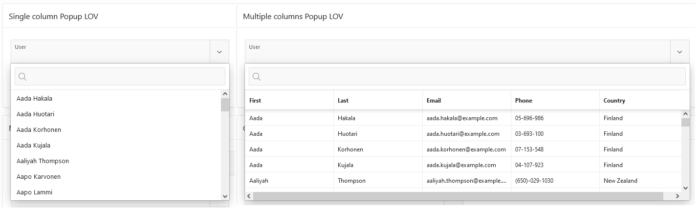
One of my favorite item type in APEX is the popup LOV, users love it because of the ability to search even across multiple columns since version 19.2. It supports single and multiple value selection and can be displayed as an inline popup or a modal dialog.
By default, APEX displays the popup LOV as a list when there is only one column and as a grid when there are several columns.
Create a multiple columns popup LOV
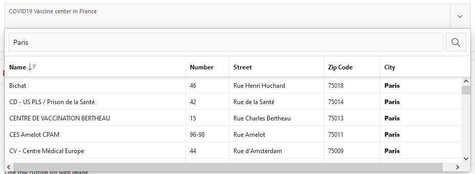
For this example I have the list of the COVID19 vaccine center in France, I want to display the name of the center, the address, the zip code and the city. Start by creating a list of values in Shared Components with this query
select
     id
   , name
   , street_number
   , street
   , zip_code
   , city
from vaccine_center
Then, in the page, add a new item, choose Popup LOV as type and select the LOV under List of Values section attribute. The item should be displayed like this.
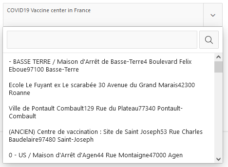
 So how do I change this, if I want the information to be displayed on 3 lines?
Define a custom template
Under the Javascript Initialization Code attribute, you can change the options object to be used during the initialization of the popup LOV. I had trouble finding the correct substitution syntax, but once again, John Snyder wrote something useful about it in his blog post All the Things That Pop Up. Take a look at the sample application, if you want to have more details.
function(options) {
    options.display = "list";

    options.recordTemplate = (
  '<li data-id="~ID.">' +
     '<div class="content-address">' +
         '<span class="center-name">~NAME.</span>' +
         '<span class="center-address">~STREET_NUMBER. ~STREET.</span>' +
         '<span class="center-city">~ZIP_CODE. ~CITY.</span>' +
     '</div>'+
  '</li>').replace(/~/g, "&");

    return options;
}
The item should be displayed like this now.
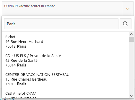
 Not so bad, but we can make it better by applying this simple CSS rule to the page (learn more about flexbox here
.content-address {
      display: flex;
      flex-direction: column;
}
And like magic, the popup LOV is now displayed in 3 lines as I wanted.
Advanced examples
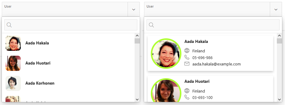
Here is two examples, one is a simple user list with small avatars and the second one is a cards list with avatars and icons.
List of values
In this two examples, I use the same list define with this query. Datas comes from randomuser.me which provides an API to get a list of users. Really cool when you want to build some demos!
select
      u.id
    , u.first
    , u.last
    , u.email
    , u.phone
    , u.large as picture
    , u.country
    , u.city
    , u.age
    , u.date_ as birthdate
    , u.first|| ' '|| u.last as full_name
from user_data u
Simple List with Avatars
Javascript Initialization Code:
function(options) {
    options.display = "list";

    options.recordTemplate = (
  '<li data-id="~ID.">' +
     '<div class="content-list">' +
        '<img class="avatar-list" src="~PICTURE." alt="User Avatar" loading="lazy">' +
        '<div class="user-infos-list">' +
           '<span class="user-name"><b>~FIRST. ~LAST.</b></span>' +
        '</div>' +
     '</div>'+
  '</li>').replace(/~/g, "&");

    return options;
}
CSS code:
.avatar-list {
  border-radius: 10px;
  width: 50px;
  height: 50px;
}

.content-list {
  display: flex;
  flex: ;
  flex-direction: row;
}

.user-infos-list {
  margin: ;
  margin-top: 15px;
  margin-left: 15px;
}
Cards with Avatars and Icons
Javascript Initialization Code:
function(options) {

    options.display = "list";

    options.recordTemplate = (
        '<li data-id="~ID.">'+
            '<div class="card">' +
                '<img class="avatar-card" src="~PICTURE." alt="User Avatar" loading="lazy">' +
                 '<div class="user-infos-card">' +
                     '<span class="user-name-card"><b>~FIRST. ~LAST.</b></span>' +
                     '<span class="user-info-card">' +
                         '<span class="fa fa-globe user-info-card-icon" aria-hidden="true"></span>'+
                         '<span class="user-info-value">~COUNTRY.</span>'+
                     '</span>' +
                     '<span class="user-info-card">' +
                         '<span class="fa fa-phone user-info-card-icon" aria-hidden="true"></span>'+
                         '<span class="user-info-value">~PHONE.</span>'+
                     '</span>' +
                     '<span class="user-info-card">'+
                         '<span class="fa fa-envelope-o user-info-card-icon" aria-hidden="true"></span>'+
                         '<span class="user-info-value">~EMAIL.</span>'+
                     '</span>' +
                 '</div>' +
            '</div>'+
        '</li>').replace(/~/g, "&");

    return options;
}
CSS Code:
.user-infos-card {
  margin: 1rem 1rem 1rem 2rem;
}

.user-name-card {
  margin-bottom: 1.5rem;
}

.user-info-card-icon {
  margin-right: 1rem;
}

.user-info-card {
  margin-bottom: 0.5rem;
}

.card {
    box-shadow: 0 4px 8px 0 rgba(0,0,0,0.2);
    transition: 0.3s;
    display: flex;
    flex-direction: row;
}

.card:hover {
    box-shadow: 0 8px 16px 0 rgba(0,0,0,0.2);
}

.user-infos-card {
  display: flex;
  flex-direction: column;
  flex-wrap: wrap;
  margin: 1rem;
}

.avatar-card {
    width: 100px;
    height: 100px;
    border-radius: 50%;
    border: solid 5px greenyellow;
    margin-left: 1rem;
    margin-top: 0.85rem;
}
What next?
Now, your imagination is the only limit to display nice popup LOVs in your application! You can find the live demo here
I hope you enjoyed these tips!


