

How to make your mobile APEX application look like a native one - Part 3
Universal Theme mobile patterns


Introduction
This post is the third part of a series on customizing the look and feel of the Oracle APEX mobile application to mimic a native application. If you haven't read part 1 and part 2 it might interest you. This part will show the available options that the Universal Theme offers out of the box and probably one or two tips as well. Let's begin.
Application Navigation
When it comes to having a mobile-friendly navigation menu in an Oracle APEX application you have three options which are detailed below in the order I prefer. To update the navigation menu of your application, you have to go to Shared Components \ User Interface Attributes \ User Interface \ Navigation Menu and choose the settings you want.
Top Navigation Tabs
To me, this is the best option and I will explain why in a minute but first let's see how to configure it by settings the attributes like this
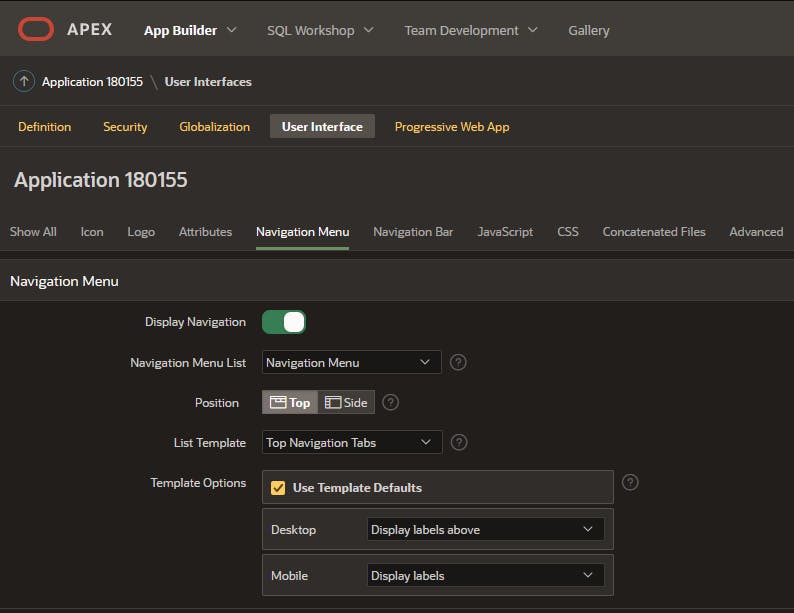
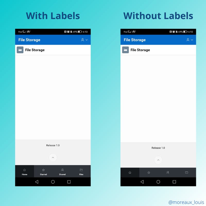
By settings the attributes this way, you will get a sticky menu at the bottom of the screen displaying or not the labels depending on the Template Option selected.
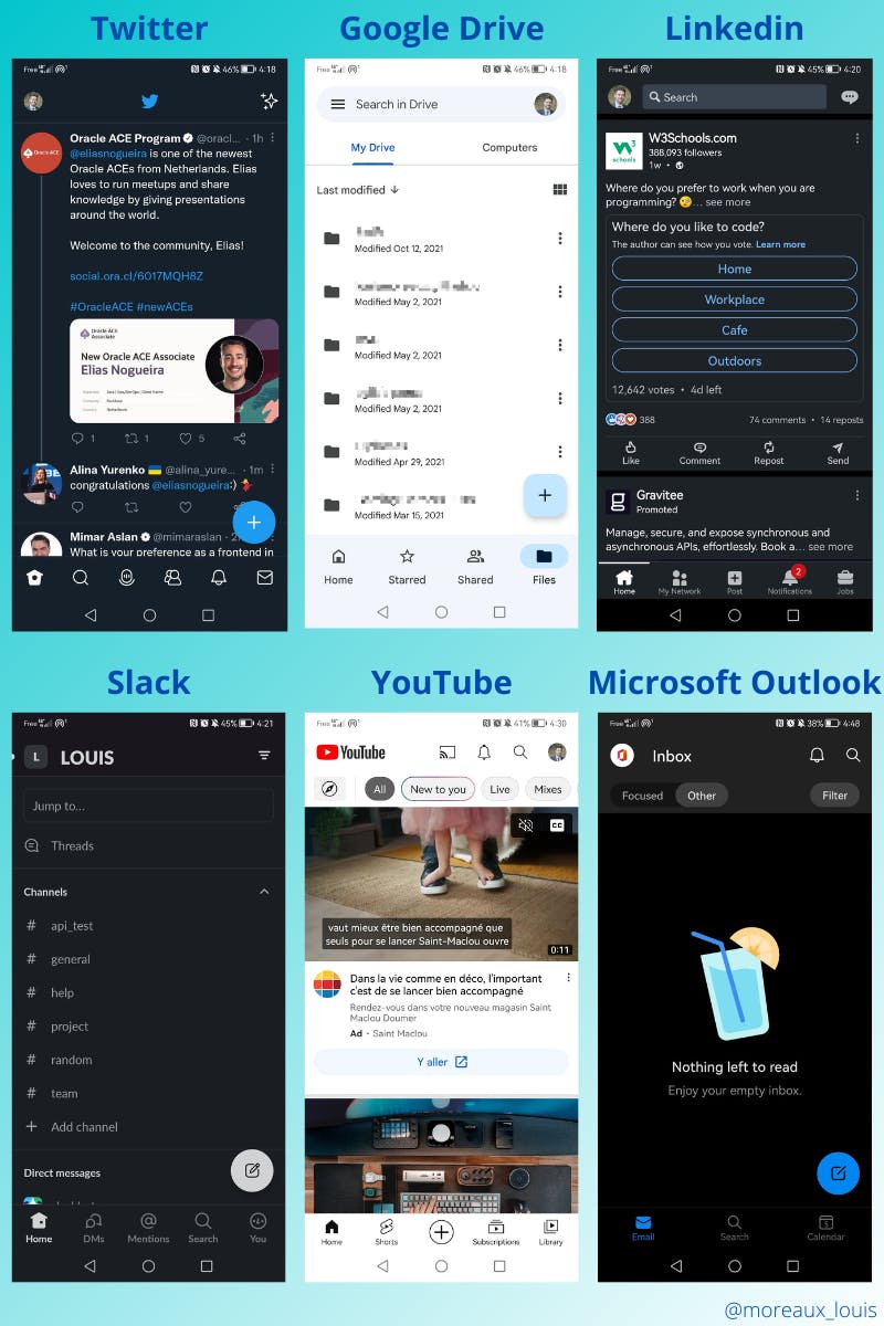
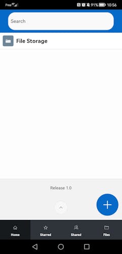
So now, you will probably ask why should I choose this one instead of the others options I will show you. Then this is just because one of the main points in UI/UX is that people don't want to learn how to use your apps and they like to see something that they already know. So as a final argument, here is six applications that are probably used by millions of person each day, and guess what? The menu is a tab menu at the bottom so why don't make your users happy right?
And if you need a last argument, then we have to talk about usability and the fact that when we are holding our mobile devices some zones are easier to access than others. This illustration from Stephanie Walter, UX Researcher & Designer, shows that the bottom tabs navigation is the most accessible to the users.

Side Navigation Menu
This one is the default when you create an application and we all use it every day in our desktop APEX applications. It can be useful if you want to display more entries but it requires two taps for the user to navigate to a new entry. Here are the settings to get it
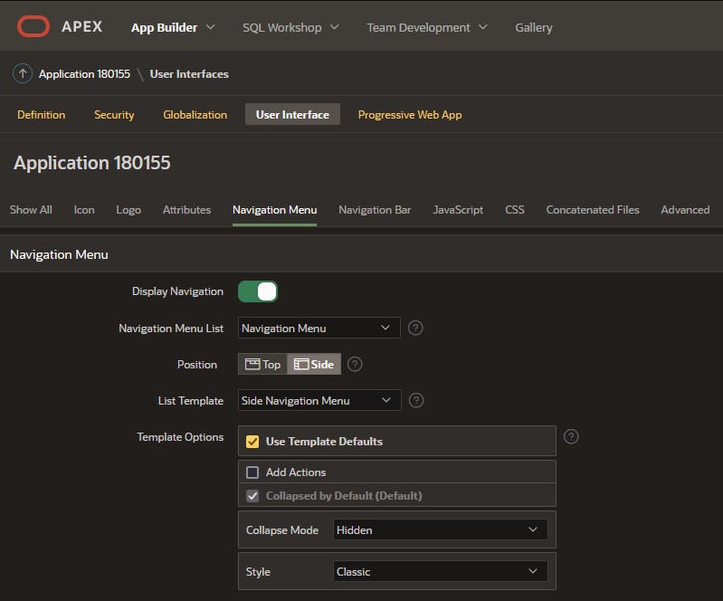
I recommend you always keep the Collapse Mode attribute on Hidden for mobile to avoid losing space on small screens. But you can play with the Style attributes to find the settings you love.
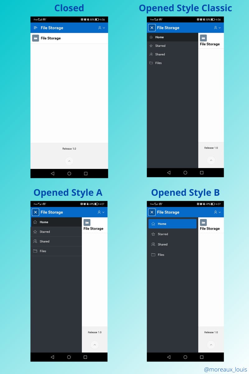
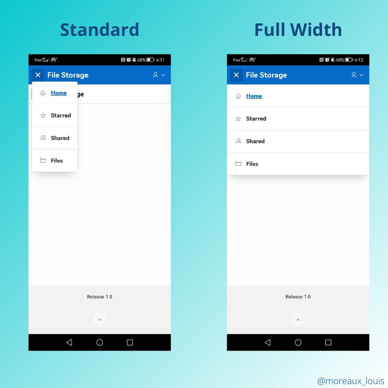
Top Navigation Mega Menu
The last option is the Mega Menu which works well on mobile devices but is in a difficult area for touch interactions. Here is how to configure it
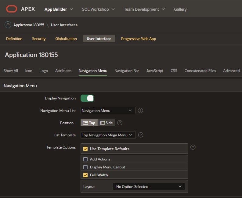
As you can see, I also check enabled the Full Width option because I found it, personally, better but I let you decide what you prefer
Note: I haven't shown you this menu closed because it renders exactly as the side navigation menu.
Position your controls
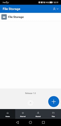
The main action
In many applications, you have an add button which is either located in the middle of the bottom navigation bar (Linkedin or YouTube) or just above it (Twitter, Google Drive, Slack or Microsoft Outlook). While adding the first one is pretty simple, just add a new list entry and you are all set the second one is a bit more tricky...
First, create a button on your page directly on the body and set the following attributes:
Button Template: Icon
Hot: true
Template Options \ Size: Large
Icon: fa-lg fa-plus
Static ID: add-btn
Then we have to apply two CSS rules to make our button a much better look
#add-btn {
    position: fixed;
    bottom: 80px;
    right: 10px;
    z-index: 100;
    height: 65px;
    width: 65px;
    border-radius: 50%;
}

#add-btn .t-Icon {
    font-size: 2rem;
}
You should get something like this, not so bad right?
The search bar
Another common pattern is to have a search bar at the very top of the application in the top navigation bar. Fortunately, since APEX 21.2, we can position elements with a lot more flexibility than before. To add it to the header just set the attribute Layout \ Position to the appropriate value. In the example below, I picked Before Navigation Bar
The sticky headers and footers
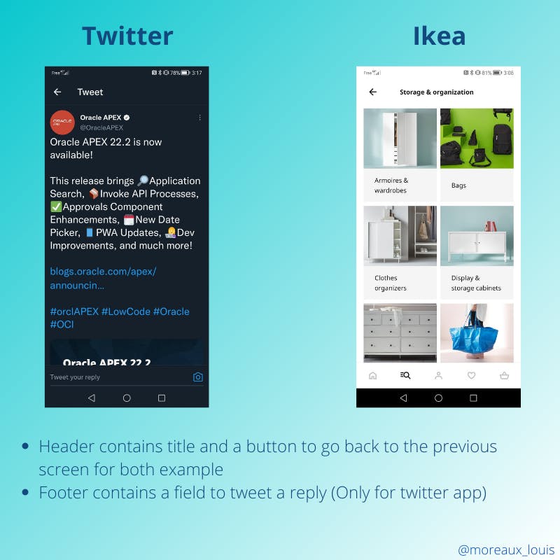
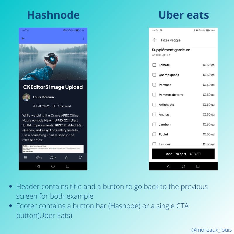
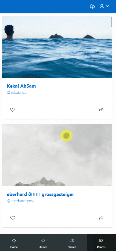
On mobile devices, two screen areas that are used to display actions are the header and the footer. Look at these examples where sometimes both footers and headers are used to enhance the user experience.
The good news here is the Universal Theme offers a way to configure both easily.
Configure the sticky header
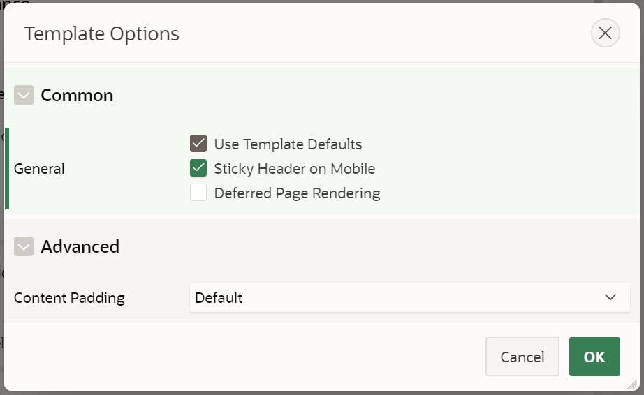
It's pretty simple to do it, go to the page attributes and, under Appearance open the Template Options page.
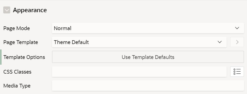
Under Common, make sure that Sticky Header on Mobile is checked
Configure the sticky footer
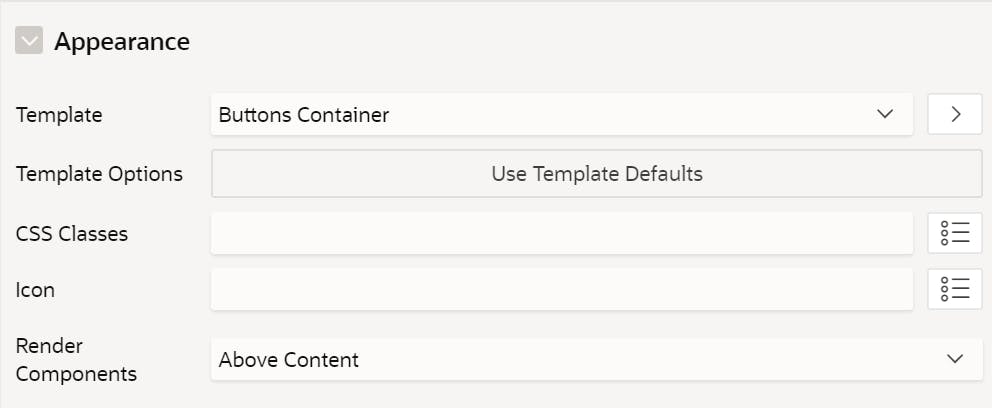
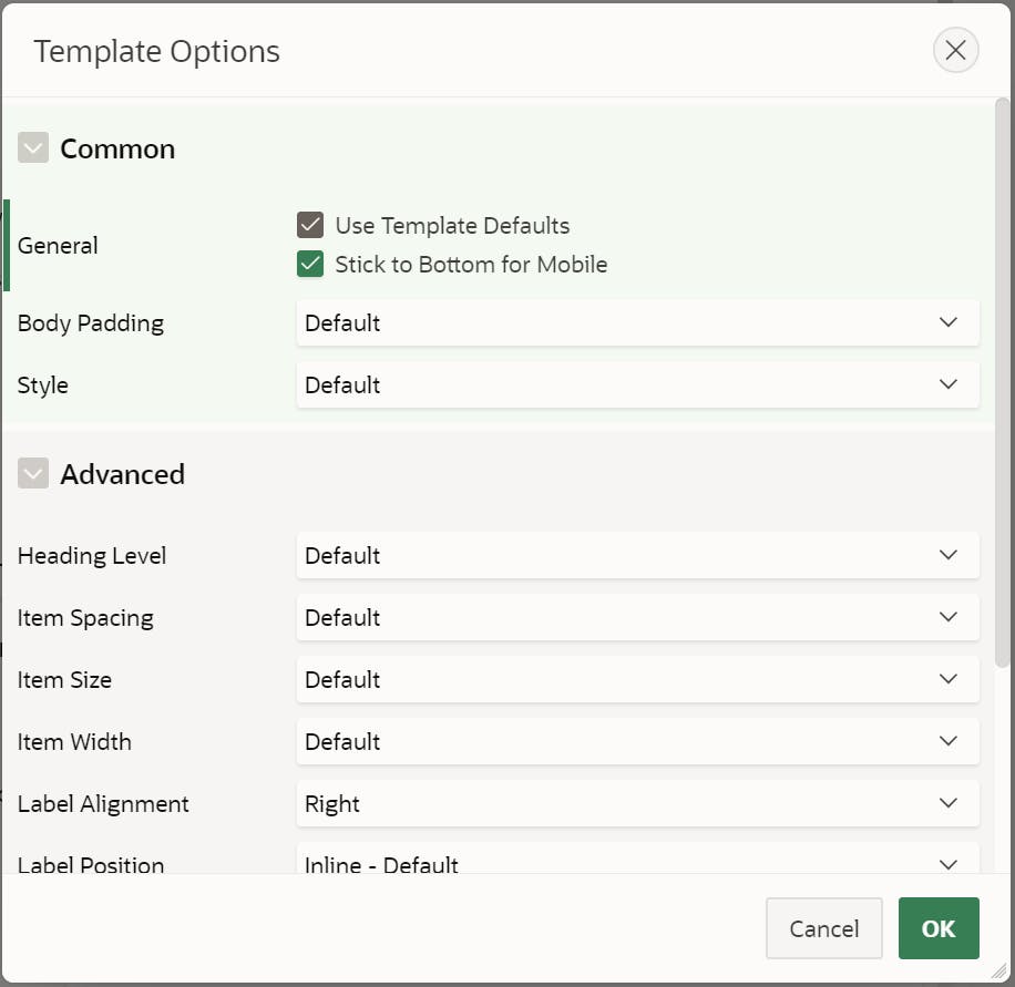
To add a sticky footer, you need to add a button container to your page and Under Appearance open the Template Options page.
Under Common, make sure that Stick to Bottom for Mobile is checked
Example
By adding one back button and a label to the header and a bunch of icon-only buttons to the footer, you get something not bad in a snap!
Conclusion
As you can see in this blog post, the Universal Theme has a lot to offer when it comes to developing a mobile application with Oracle APEX. By using native UT features, you can enhance the user experience a lot and by adding a few customizations, you can have an application that looks like a native one.
I encourage you to take a look at the Universal Theme application to see what is possible out of the box with APEX and get some inspiration to build great apps
It took me some time to put my ideas together to write this one and found some good examples. I hope you will enjoy it