

Photo by Pankaj Patel on Unsplash
Oracle APEX - Universal Theme CSS utility classes
Fine tune your UI with built-in classes


Introduction
In this blog post, we will deep dive into the CSS utility class available within the Oracle APEX Universal Theme by answering the following questions:
What exactly is a CSS utility class and how does it differ from traditional CSS?
What are the CSS utility classes available in Oracle APEX?
CSS utility class: What is that?
Here is a basic example to understand the concept:

As you can see with traditional CSS, you usually, add a specific class to an element and then write CSS rules against this class. While using CSS Utility Classes, you add classes to your markup to apply specific rules like colors, padding and even flexbox! In a nutshell, a utility class will apply a predefined set of rules to an element.
Pros and cons
Pros:
No more headaches while trying to find the perfect class name
Classes are reusable and you can apply them to many elements (How many times did you write padding or margin rules?)
Cons:
The HTML markup can contain a lot of classes which makes the readability less clear
You have to update the markup to apply a style change although, with the traditional approach, you could just tweak your CSS
While writing this blog post, I enjoyed playing with this concept and found that the benefits are more important than the drawbacks. But it's just my feelings, you should test it and see if it fits your needs.
Which types of classes are available?
There are many utility classes available within the Universal Theme and you can find them in this UT application but I wanted to present some of them here. How I choose that list, it's the ones that I used the most frequently and I think you may be interested in knowing they exist and how to use them.
Color
The Universal Theme comes with a color palette that contains 45 different colors and, of course, you have CSS utility classes for each one of them. I said classes because there are multiple types:
The first one
u-color-xxwill define the fill, stroke and background-color properties as well as the color oneThe second one
u-color-xx-textwill only define the color propertyThe third one will
u-color-xx-bgwill define the fill and background color propertiesThe last one
u-color-xx-borderwill define the stroke and the border-color properties
They are pretty handy when it comes to styling something nicely with the color palette!
Margin and padding
Again we frequently have to tweak the margin and padding in our applications to style them as we want.
The syntax is quite simple:
The property
paddingormarginThe optional direction:
top,bottom,rightorleftThe size:
none,sm,mdorlg. An extra option isautowhen usingmargin.
Again, now, instead of writing your own CCS rules, you can simply add the classes padding-sm or margin-top-lg for example.
Behind the scenes, they are just applying some predefined margin and padding CSS rules as you can see with padding-sm and margin-sm below
.padding-sm {
    padding: .5rem!important
}
.margin-sm {
    margin: .5rem!important
}
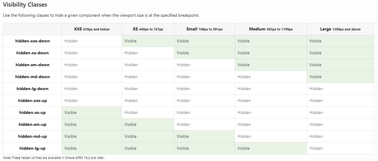
Visibility
These are pure gold actually, they let you decide whether an element is visible or not depending on the device screen size 😍. It is so useful when you want to design a page to work well on desktop and mobile devices.
Here is a little video showing the regions on the page appear and disappear while the device screen changed
Now, how does it work technically? It's fairly simple: it uses CSS media queries behind the scenes to apply the rule display: none to the element. Here are the rules for hidden-xxs-down and hidden-lg-up
@media (max-width: 639px) {
  .hidden-xxs-down {
    display: none !important;
  }
}

@media (min-width: 1200px) {
  .hidden-lg-up {
    display: none !important;
  }
}
Pretty smart isn't it? So with the available set of rules, you can tweak your pages for different screen sizes. Here is the table showing if an element is displayed or not depending on the screen size and the classes applied
Flex
These are so useful for example when you want to style your card's body for example! See the example below for my post about card item selection
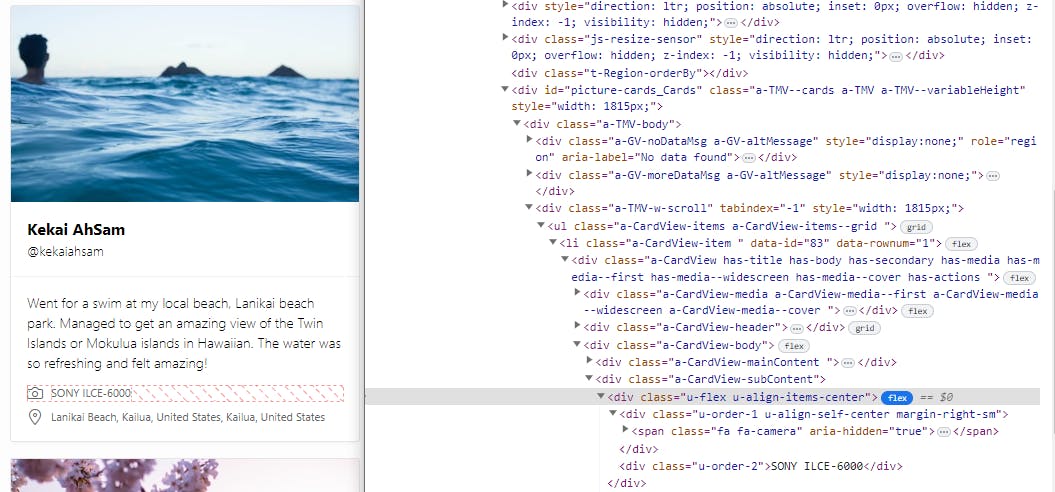
As you can see, I added two flexbox containers using the u-flex class and each of them contains two items. You can control the order using the u-order-n classes as well as alignment, direction, etc. The complete list can be found here
Conclusion
I love using these utility classes while developing an APEX application because they offer simplicity and consistency. I haven't listed all the existing classes so I recommend you to take a look at the Reference section of the Universal Theme application to discover all of them!